Designer Improvement 2: Understanding Visual Composition
Mar 6, 2025
Background
Today, creating a good UI design isn’t as hard as it used to be, one of the crucial factors is that there are a lot of designers that have created more designs in the last several years. Looking for a design reference was hard 10 years ago. We haven't found a “like” feature since 25 years ago, or a Chat platform that nowadays is a must-have feature in most applications/websites.
The design progress is really fast, especially during the Covid-19 pandemic. People just stayed at home, and they made a lot of things, and learned something new, all of it was done during the pandemic. But, in this fast progress of UI/UX, many “new” designers seem to forget about something crucial. It's about design goals, every product or design must have a goal to be achieved. It could be solving a user problem, or reaching business objectives.
Problem
A good and beautiful design is something common nowadays, but we still find a lot of junior designers who just “take” a looking good UI design reference from dribbble or other sources without knowing what is the objective of those designs. Because, in my opinion, taking references nowadays is no more like copying the visual, component, layout, or even color without understanding what are the reasons behind the design. Is it something bad? No, this is fine, but if you could break down all the reasons behind the design, you could give a better approach to your own design works.
Solution
One of the most fundamental things is understanding composition. Normally, composition is used in art, and illustration. However, the concept is still similar and applicable as well for UI design. To get a better understanding of the composition concept, let’s check these explanations.
Size

Can you see these two circles? Which one is heavier, or taking your focus more? I guess it is the big one, right? It means that size matters, it affects how the user will see our design. For example, if you have two buttons in your design, of the same color but different sizes. Which one takes your focus more? Which one makes you click the button? Normally the bigger one is the answer. So, you need to understand that the bigger component will likely attract the user’s eyes first.
Color
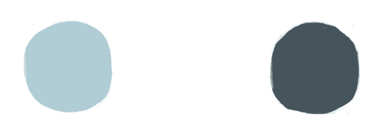
Next, there are two circles of the same size, but the color is different. Which one is heavier? The right one! Correct! How could it be? This one is also an example that visual composition is not only about size, but also what color we choose. The darker color tends to make the user’s eyes focus more than the lighter one.
Color + Size
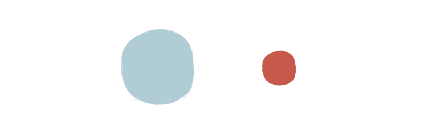
The 3rd one, from these two different circles which have different colors. Which one seems to be heavier? The small one? Correct! With the more contrasting color, and even smaller size, the red one seems to be heavier.
But why? This red color is special. Naturally, the red color will make humans alert and focus instantly. Historically, this might be related to our ancestors, who often got hunted by predators. Saw blood or fire, made the human brain stay alert to the danger of this color.
UI example for using visual composition
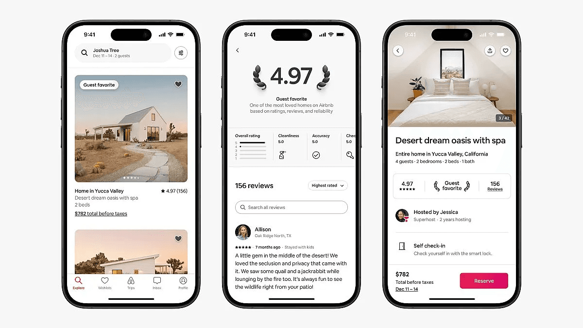
We can see from the example above (Airbnb App). We can see there, that the most attracts our eyes is the Reserve button on the below-right of the product detail page screen. This is an example of visual composition, the placement is also good because it’s easy to reach for our thumb to click the CTA.
Thank you!